SARS-CoV-2 Buenos Aires strains DNA analysis
The laboratory where I worked was part of Proyecto-PAIS, a country-wide effort in Argentina to sequence and analyse SARS-Cov-2 DNA samples. As member of one of the bioinformatics nodes, I developed some scripts for the visualization of results.
All plots displayed here were built with Python’s matplotlib and seaborn.
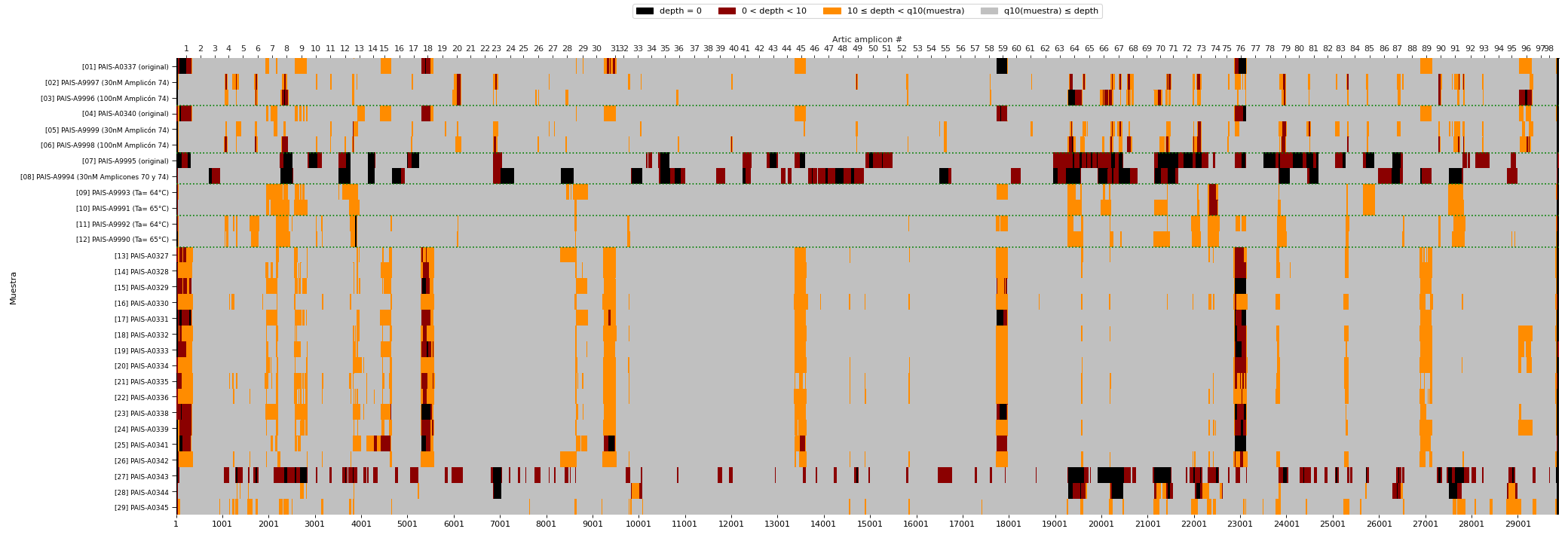
Heatmap of DNA library performance
In modern DNA sequencing technologies called “NGS”, the “depth” of sequencing is a key metric to understand the quality of the experiment. More depth means more data for a given DNA region, that allows to make a call on the presence or absence of mutations.
This heatmap summarizes the sequencing depth in different regions of the SARS-CoV-2 (Coronavirus) genome using one particular technology. On the X axis the regions of the genome are represented. On the Y axis we see different groups of samples. Grey regions indicate that the depth is ok, yellow regions indicate a problematic (low-depth) region, and red/black regions indicate absence of data.
Vertical regions of yellow or black/red patches are evidence of parts of the genome that are difficult to sequence across samples. Horizontal stretches of yellow/red/black patches show that one particular sample might have had low-quality DNA.
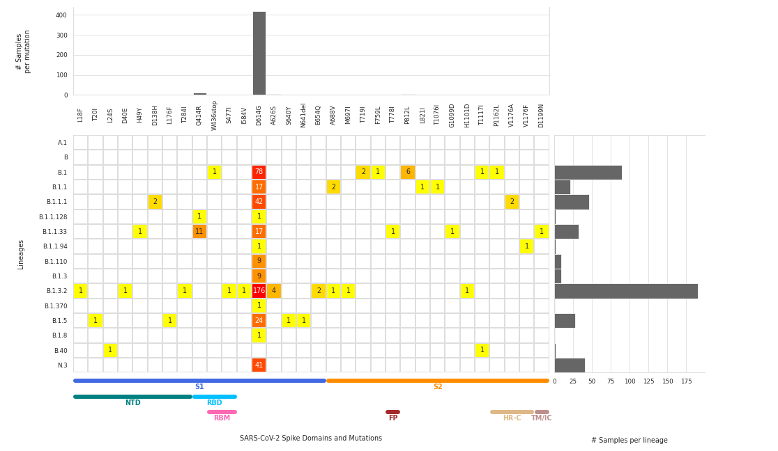
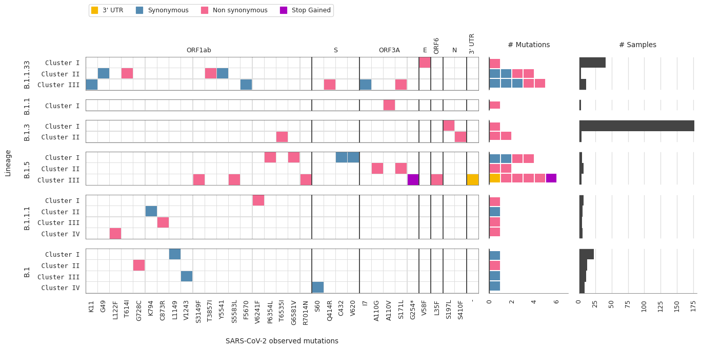
Types of mutations per lineage/cluster
Individual mutations in the first X axis with aminoacid change and position nomenclature. Lineages and clusters within lineages in the Y axis. Marginal histograms are also shown to summarize types of mutations and number of samples corresponding to each SARS-Cov-2 lineage/cluster.
Number of samples representing each mutation/lineage
The number of samples is displayed for each individual combination of lineage and mutation type, while the marginal histograms display total samples per mutation (top) or per virus lineage (right).